Liked https://pimpmytype.com/changing-fonts/
Six things to consider before changing fonts on a website
New year, new typefaces! I pimped the type of Pimp my Type – wow, that’s meta. I’m super excited about it and wanted to use this occasion to share with you, what motivated me to do it, and what I paid attention to. So if you’re in a similar situation, this article will help you to figure out, if it’s worth the effort to change fonts on a website, or not.
TL;DR: Ask yourself why? What does not work now, and what should be better after? Decide if it’s really worth the effort, test it with trial fonts and real content, check the licenses, and expect that the spacing most likely will be off. Brace yourself for inconsistencies, and know that it won’t be perfect afterwards.
Before and after
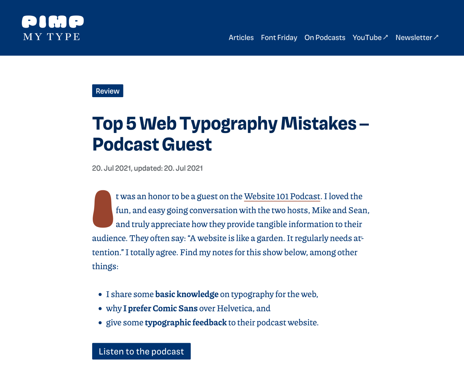
Before, I used the beautiful, soft and classical serif typeface Bressay by Dalton Maag for body text. Headlines and functional text, like navigational elements or captions, I set in the Basic Sans, a clean and softer sans-serif by Latino Type. Both were hosted via Adobe Fonts.
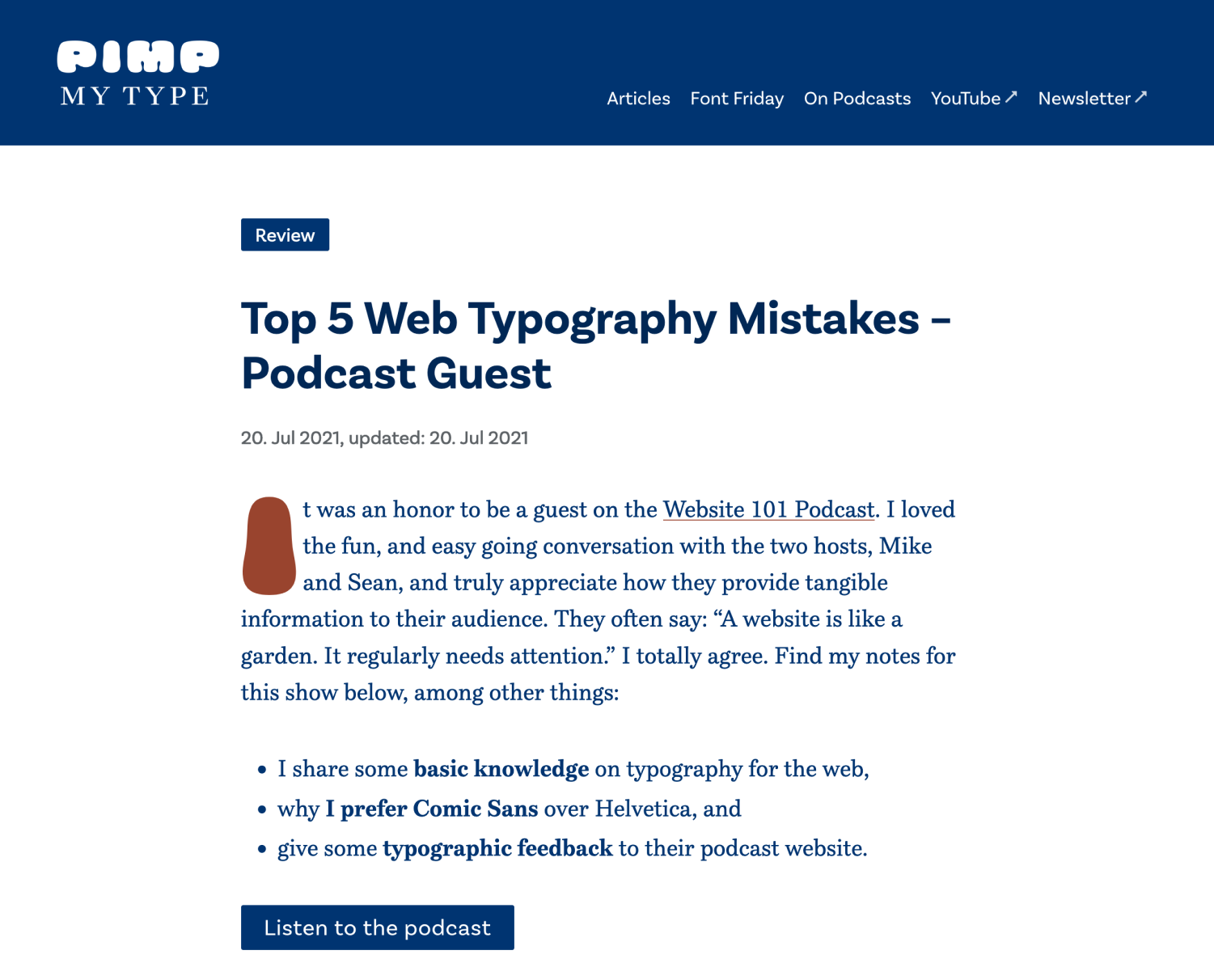
I replaced them with two of my favorite typefaces of the last year. The spiky and lively serif Piazzolla by Huerta Tipográfica for the body text. And the quirky and more expressive Grotesque Magnet by Frere-Jones Type.
After: Magnet and Piazzolla need less space, are more expressive, and easier to read in smaller sizes. Not totally different, but you can see that things changed.
Reasons for changing typefaces
First, take some time to think about why you want to change typefaces? What does not work now, and what do you expect to be better afterwards? What do you hope to achieve with the result? This will set the basis for everything. To give you an idea and some examples, I’ll guide you through my reasoning.
To set Pimp my Type more apart
I started Pimp my Type on YouTube almost 16 months ago. Back then, I wanted to keep the effort as little as possible, focus everything on content creation. This is why I used my existing, professional and unpronounceable Zeichenschatz site to push out content. I used the typography and style from there. After a year I moved it all on its own domain. Now I slowly start to differentiate the design more and more. Changing the typography was the next logical step to show that.
To create a different vibe
It should be a little less calm, a pinch more striking, more interesting, more unconventional. I wanted it to be shaper, and contrasting.
To take advantage of a variable font
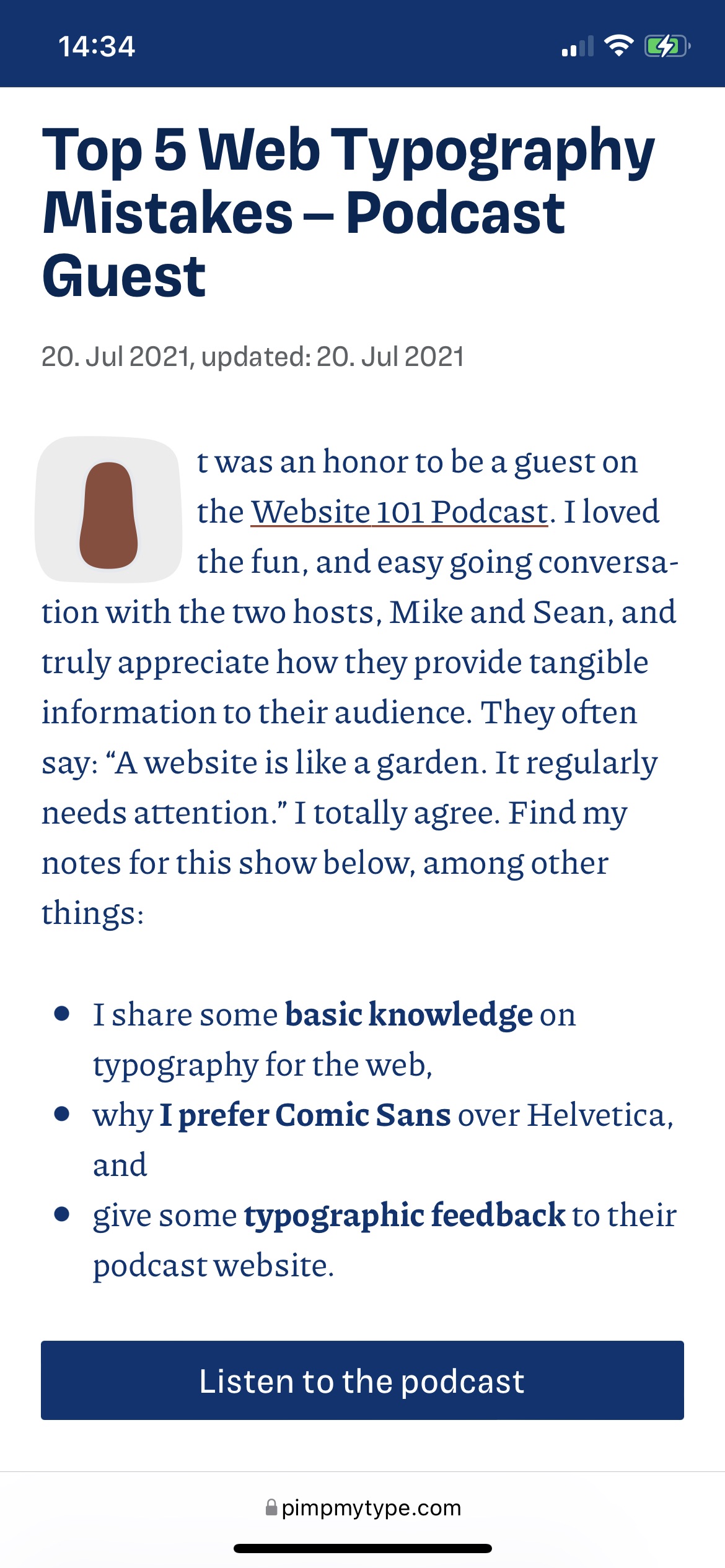
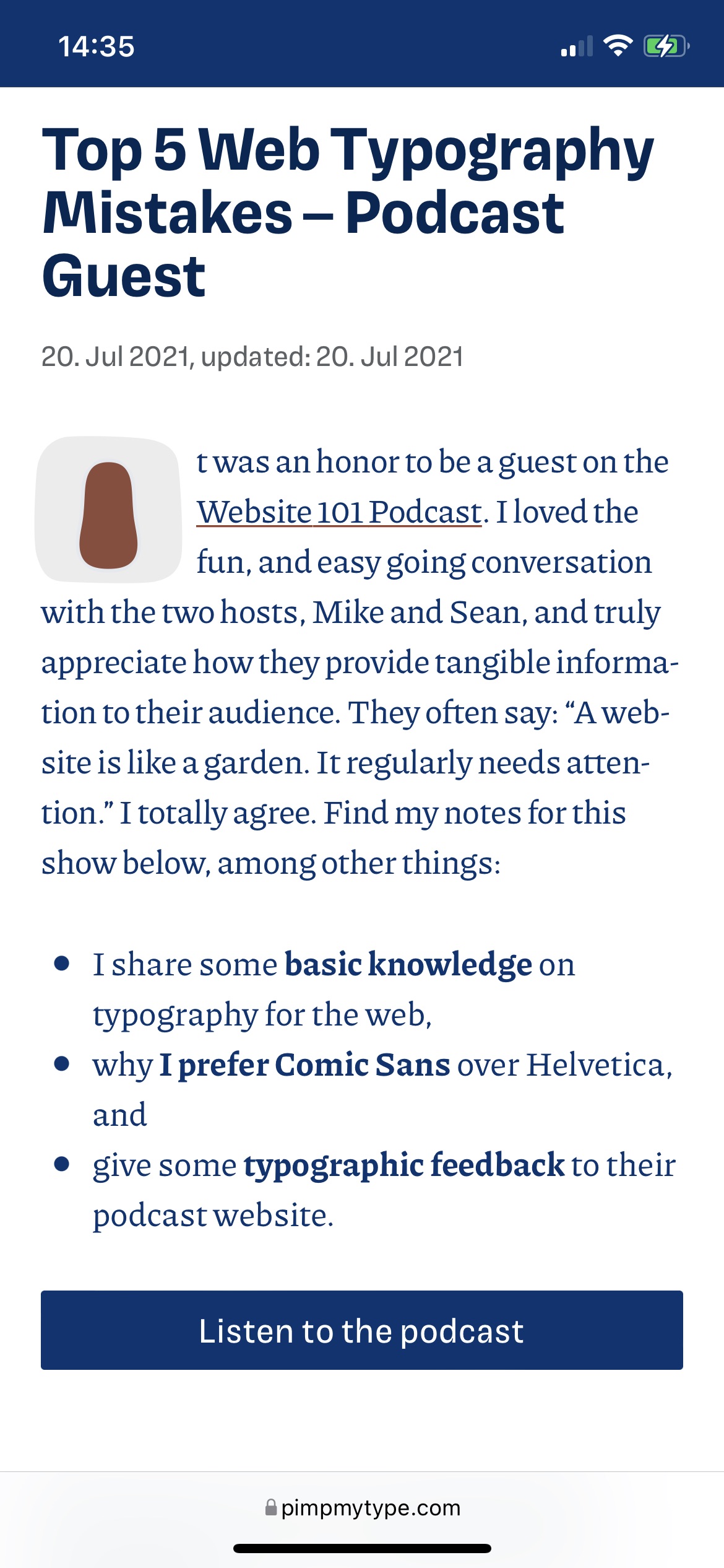
Especially from optical sizing, which is possible with variable fonts out of the box. I just love this so much, and Piazzolla comes with it. I describe it here in more detail, but optical sizing optimizes the width and text weight to the size it is set in. You can best see how it works, when you compare a before an after for mobile. It’s subtle, but powerful.
Optical sizing off: the spacing is tighter and the weight is a bit lighter. Too light and compact for small text.
Optical sizing on: Yes! Slightly sturdier strokes and wider spacing make it ideal for smaller text.
To host the fonts myself
I hosted fonts via Adobe Fonts, which is a cool tool to try things out and to design. But it has some downsides, and I want to be independent of third party services as much as possible, mostly for privacy reasons. That’s also why the YouTube player on top is not loaded instantly and only after you clicked the thumb with the crappy resolution 😉.
To optimization for mobile
I wanted a compact display typeface that also would work for functional text and still show some character. It should be rather narrow with a larger x-height, and Magnet accomplished that. Especially in the navigation and Headings, it’s much clearer now. For the body text, Piazzolla is more space-saving as well, compared to its predecessor, which makes a better reading experience.


… but it should not be too different
Make it different but not too different – sounds like a horrible client briefing, right? 😂 I wanted it to be an evolution, not a revolution. The basic idea of having a Grotesque for headings and functional text and a serif for the body text should remain. Also, the metrics should not be radically different. The reason behind that is, that I want Pimp my Type to still be recognized, after building it up for the past months.
Support Pimp my Type
Make typographic knowledge practical, fun and accessible to everyone. I’m greatful for your support in any of these ways:
- 🤘 Share it with a someone, who you think might benefit from it.
- ☕️ Buy me coffee to get me through late night editing.
- 🌟 Consider my premium services.
What to consider before changing fonts
After all this background information, and sating my case, let’s move to the six things you should consider before you change typefaces on your website.
1. Is it really worth the effort?
Work will be involved, you’ll have to revisit every typographic component and check it again. In my case – my heart just said yes to it. It makes me so happy just to look at it, so it’s definitely worth the effort.
2. Test it, if possible.
I got myself some trial fonts to try it out. I quickly sandboxed it, fell in love and then tweak the tiny details. And always test it with your real blog posts and content, if possible. Specimen sheets always look nice, but they are rarely the reality of your product.
On my desktop monitor, everything looked fine, but after going live I discovered, that the font weight seemed very light and thin on the high density screen of my iPhone 12 and my MacBook. So I used the power of the variable font and set the normal weight of the text from the default of 400 to font-weight: 450. Pro tip: when you do something like this, check if the bold text has to be bolder too, to create sufficient contrast. In my case, it was not necessary and the default of 700 worked as well. I wrapped it all in a feature query that checks if the browser supports variable fonts. I combined it with a media query that detects, if it’s a retina screen, and voilà, here’s my overcomplicated typography CSS 😂.
@supports (font-variation-settings: normal) {
 @media screen and (-webkit-min-device-pixel-ratio: 2),
        screen and (min-resolution: 192dpi),
        screen and (min-resolution: 2dppx) {
  body {
   font-weight: 450;
  }
 }
}
3. Check the license before you buy it
In my case, the desktop license of Magnet does not include broadcast use, which is – of course – important to me! So I had to check with Frere-Jones Type what additional investment this means. If it had been out of my budget, I would have reconsidered it.
4. Vertical and horizontal spacing might be off
In my case, Magnet is a little different from Basic Sans. I had to realign every button and text that was covered by a rectangular shape. The tags, the category links, etc. It was not much work, but it was work.

5. Inconsistencies with prior content are almost inevitable
You will have to live with that. There will be captions and text inside my thumbs and other graphics that I will not update to the new typeface. Because I’d rather focus on new content than polishing the exiting stuff.
6. Live with it, that it won’t be perfect
Even if all these changes are a big improvement, I still see things that are not that perfect. I’m still not sure about my gigantic animated drop cap in goofy Cheee (but I slightly updated it already and put it on a fixed blobby brackground). At times, too many typographic elements collide and create imbalance, and a twitchy feeling. Also, you have to download quite some files now. Before it was roughly 350 KB of fonts, which is already a lot. Now it’s over 600 KB. That’s not ideal, and I’ll leave it up for future improvements.
But things will never be that perfect. There will always be cases where it’s not that ideal, and better done than perfect.
I’m curious, what do you think of the new typefaces? Was it worth all the effort? Are you planning to change typefaces on your website as well, and was this helpful to you? I’m happy to read your comments below!
P.S.: Thanks to Kel, who motivated me to include a better way of comparing before and after situations. Due to his feedback, I integrated a slider to make changes more obvious.
